I started working with the Jeollabuk-do Center for International Affairs (JBCIA) in March 2018 to produce a quarterly English-language magazine featuring stories, culture, and tourism from the province. Read more about my redesign process in the first post of this series.
The magazine had been in publication already for about 2.5 years, but when the original designer and many of the original contributors left, they were looking to rebuild the team to kickstart the project again. I updated the original design, and created a new masthead logo for the project when I began the work.
Original Design
As far as the original design was concerned, there were a number of things I wanted to update.
- I wasn’t a big fan of the logo, and I wanted to give the new magazine a proper “masthead” type logo
- I felt like the original design (particularly the cover) made the magazine look more like a travel brochure than a full magazine, so I wanted to change that whole look and feel – so I studied loads of well-known and travel magazine designs before starting
- Personally, I didn’t like a serif body font with sans-serif headings, and wanted to reverse those – sans-serif for the body, serif for the headings
- I like an extra line break between paragraphs, rather than indentation
- I wanted to create a lot of extra whitespace to use for things like titles, pull quotes, design elements, and so on
- I also wanted to mix up the layout for each story and not simply fall back on a standard two-column grid for everything


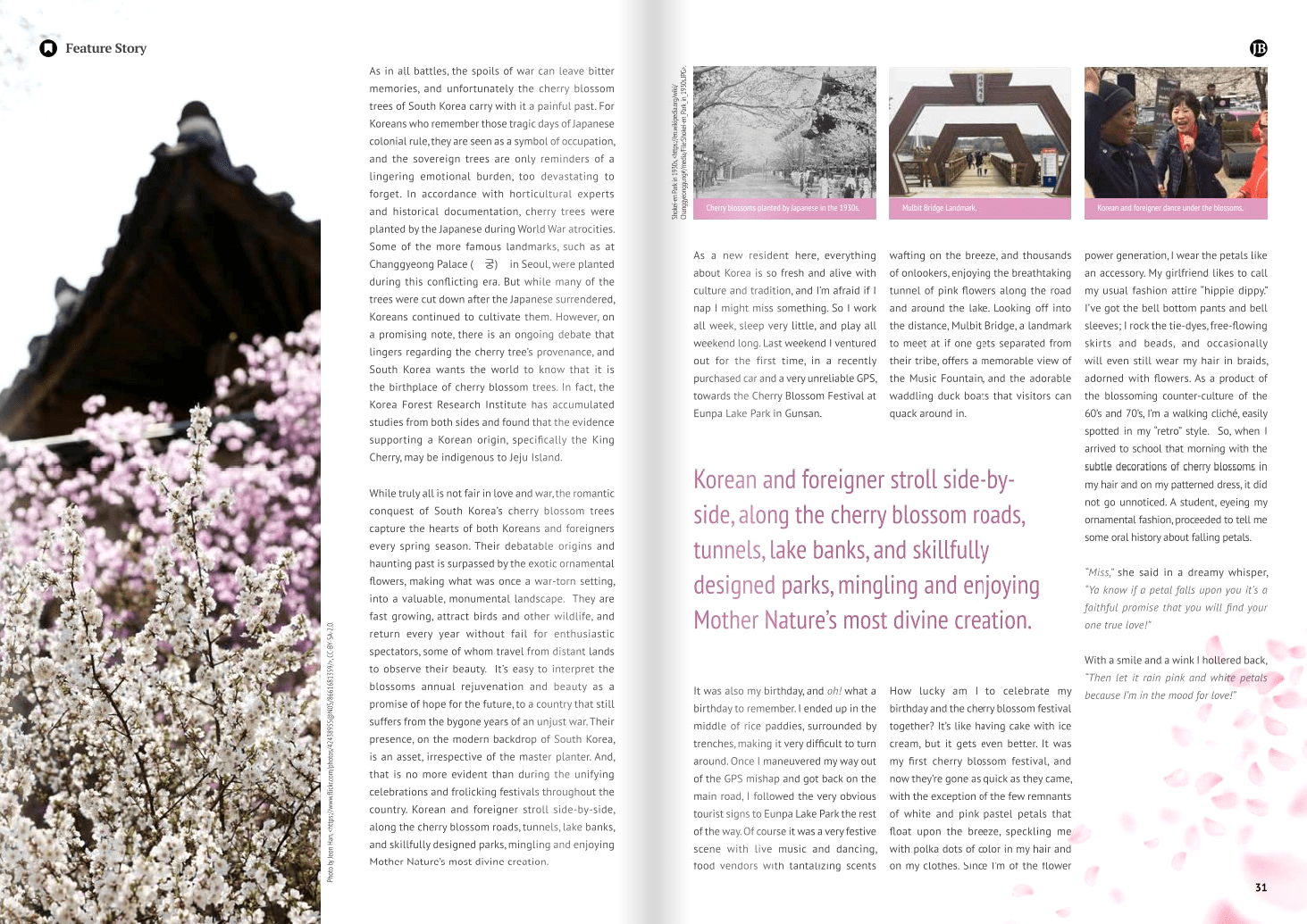
You can notice a number of the changes I put into place by observing the differences between the original magazine’s cover and featured story and my first design’s cover and featured story.
The full new design is available below to view online. If you would like to pick up a (free) printed copy, you can visit the JBCIA office at:
전라북도 전주시 완산구 홍산로 276 (효자동3가 1525-2)
New Design
Besides the changes that I wanted to make, there were a few additional requirements from the JBCIA office:
- Korean translations needed to be included (Chinese added in 2020)
- At first, we added summaries at the beginning
- Later, we tried side-by-side full-article translations
- Currently (2020), we are adding summary translations within the articles themselves
- JBCIA News and updates must be included in each issue
- And from Fall 2018, also the World Boyscout Jamboree logo/news
- Additional Contents (updated Fall 2019)
- JBCIA News
- Jamboree
- Provincial Policy
- Festivals & Cultural Events
- Tourism Hot Spots
- Foreign Community Events
- Local University stories
- JBCIA News
Spring 2018 v.10
Stories
- Korean Translations p. 8-11
- JBCIA News p. 14-19
- Making a Home in the Heart of Korea (Interview) p. 20-23
- The Power of the Silver Screen (JIFF) p. 24-27
- It’s Reigning Cherry Blossoms p.28-32
- Gunsan Cherry Blossom Hot Spots p. 33
- Seonyudo, Lost Paradise p. 34-35
- On the Right Track (Train village) p. 36-39
- Hanok Rail Bike p. 40-41
- Unexpected Discoveries (Art Gallery) p. 42-43
- Sense and Savor (Japanese Restaurant) p. 44-45
- Of Coffee, Tea, and Culture (Indian Tea house) p. 46-47
- When First Impressions Matter (Coffee shop) p. 48-49
- Delicious Blooms (Cherry blossom foods) p. 50-51
- Cherry Blossoms: A Symbol of Renewal and Regret (Photography / Poetry) p. 52-56
- Jeolla Dialect (뭐여) p. 57
- Do you know Jeollabuk-do? p. 58-60
Stories I wrote

- Hanok Rail Bike (Jeonju)
- Do you know Jeollabuk-do?
- (Information compiled from the Jeonbuk provincial office site)

Leave a Reply