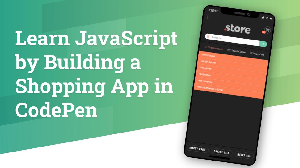
Learn JavaScript by Building a Shopping App in CodePen

Learn by doing! The best way to learn JavaScript is with projects, so we’ll be building a shopping app in CodePen.

In this tutorial, we’ll learn how JavaScript can manipulate data and the DOM to create a multi-screen, dynamic web app, right inside CodePen. We will walk through the app-building process together: from creating app screens in HTML & CSS, to adding basic JavaScript functionality with button presses, to adding basic data processing. This tutorial is aimed at beginner developers.

Lesson Outline

The following is a tutorial that was presented at JS Conf Korea 2019 on September 3, 2019. It is a 4-part tutorial. The first part (Introduction & Overview) is presented here, but the other three parts are part of an online course I’m creating.

  1. Introduction <this part>
  2. Building the Shopping List Screen
  3. Building the Store Screen
  4. Building the Cart Screen

Material required

Introduction

As you may have noticed in my bio, my name is Aaron Snowberger, and I’m a frontend designer/developer who likes to dabble in backend and mobile technologies. My current passions include React, React Native, Node, and the WP REST API. I’m also a Google Certified Trainer who has taught computer science and graphic design in high school since 2013. I’m passionate about helping new learners discover the joys of JavaScript.

The web project this tutorial introduces is for a project that I built with my high school students in the Spring 2019 semester.

My class began the project with a review of HTML structure and CSS styles in order to create the overall look and feel of the web app. But the project’s main focus was to introduce my students to the beauty of JavaScript, and that is what the bulk of the tutorial will cover.

Why JavaScript

There are many reasons why JavaScript is a particularly useful programming language for new learners. Here are just a handful of them:

  1. JS is the third leg of the code-tripod that builds websites. Whereas HTML & CSS are not really programming languages per se (they are markup languages concerned with presentation, not function), JS is actually a functional programming language that can create interactive applications – and not just online brochures.
  2. JS is everywhere. The majority of the world’s websites utilize JavaScript somewhere – it provides much of the interactivity on a site – and it can also be used to build mobile applications (React Native, NativeScript). As such, the majority of the world’s population with access to the Internet is in contact with JavaScript on a daily basis.
  3. JS is noob-friendly and (relatively) easy to learn. Compared with many other true programming languages, JavaScript’s syntax and key concepts are rather straightforward and relatively easy to learn. So much so that middle school and high school students can pick it up, and there are even some block-building languages (like Blockly and Scratch) which are based on JavaScript and taught to even younger students. JavaScript is also one of the easier languages to debug.
  4. JS is also quite powerful. Some of the top websites in the world like Facebook, Instagram, AirBnB, and Netflix utilize JavaScript in their webpages and mobile apps. JavaScript can be used to power either the frontend or the backend of websites, and there are hundreds of very powerful frameworks and libraries of code available to work with.
  5. JS is undoubtedly fun to work with. By its very nature, powering websites and providing their functionality, JavaScript is highly interactive and visual, giving you the ability to build animations, powerful UIs, games, and apps. Plus, it’s even more fun when you realize you can build something that millions of people around the world can enjoy together.
  6. Learning JS can lead to a bright future. The JavaScript ecosystem is rapidly evolving and has seen much growth and change in recent years. As such, JavaScript skills are in high demand and salaries for skilled JavaScript developers are also high. Additionally, by learning the fundamental concepts all programming languages share (loops, conditionals, functions, classes, and so on), students can more easily pick up skills in additional – or more difficult languages as well.

About the Shopping App Project

AKA “How we’ll build this…”

JavaScript is primarily used to access and modify elements within a website. Therefore, we need to learn JavaScript by coding a project that has multiple moving parts, buttons, and interactive elements. A shopping app provides just such an opportunity.

Project Considerations

Each of the three “screens” in this app will be discussed in more detail below, but here is a quick overview of what we want each screen to do and how.

  1. Shopping List Screen
    • Performs like a To-Do List
    • We click a button to “add” or “remove” an items from the list
    • Type in the input field to “create” a new item (task)
    • Drag an item to the side to “delete” it (animate this)
    • Include Reset buttons to restore the original list to its defaults
    • Also include additional visual feedback (CSS animations) so the user can see what effect their interactions are having on the app
  2. Store Screen
    • This needs to include a collection of data – say at least 20 different items we can Search through and Add to our cart
    • We want to be able to change the View Type (from list to grid and vice versa – CSS Grid is a perfect tool for this)
    • We want to include filters such as Category, Price, and so on
    • We also want the Store to be searchable
    • We need to include some functionality to “Add” items to our cart so that when we click over to the Cart Screen, those items are there
    • We also need some kind of animation or visual feedback for the user (this can be handled with pop-up “Toast” notifications)
  3. Cart Screen
    • The cart will contain “cloned child nodes” from the Store Screen when the user clicked “Add to cart”
    • It needs to be able to dynamically update quantities and prices
    • And we also want to include some kind of nifty Checkout progression or modal and possibly a nice “shipped out” animation

First, some notes on HTML & CSS

  • HTML Structure
    • Use semantic markup (<nav> or <aside> rather than always <div>) & descriptive class names (like "shopping-list-item")
    • This helps you to think in a more modern, modular style when you build the structure (like components) first
  • CSS Style
    • Some useful visual indicators and design tools include:
      • My personal favorite design touch is using a dark bottom-border and light top-border on each list item – to give the appearance of three-dimensions and shadows
      • Transitions for everything are useful
      • Animations & keyframes also allow us to give visual clues to the user by doing things like jiggling the Cart icon when an item is added or removed
      • Additionally, transforms, opacity, and positioning can help us a lot
    • CSS Grid & Flexbox are also particularly useful tools (especially since React Native utilizes flexbox, so it’s good practice here if we want to work with React Native later)

1: Shopping List

Originally, this shopping app was designed to behave primarily like a To-Do list. So, it was more like a shopping list app that incorporated the following:

  1. A pre-built list of items
  2. To which new items can be added (input field)
  3. Items can be clicked on and marked as completed (purchased) with a strikethrough
  4. Or items can be removed from the list altogether (by dragging it off the screen)

After these initial functions were built, it seemed like a good idea to allow users to also do them in bulk, so the following buttons were added:

  1. Empty Cart – systematically goes through the list of items and removes the strikethrough, also returns the cart number to zero
  2. Delete List – systematically (and programmatically) removes each item from the list by “dragging” it off the screen in order
  3. Reset All – systematically resets the list to its original defaults by adding all the items back in

In addition to the functionality listed above, in order to provide adequate visual feedback to the user, CSS transitions, animations, and pseudo-elements were added to make the app appear as though every button click or input was having a (non-simultaneous) effect.

This meant that all the functionality of the app was given a 300-1200ms transition, for adding, deleting and so on. “Purchased” items appear to float up “into” the shopping cart, and bulk actions don’t happen all at once, but sequentially with a short delay between each item.

Shopping List Toolbox

The following is a list of necessary JavaScript knowledge to add to our mental toolbox in order to build the Shopping List screen:

Let’s build the Shopping List Screen!

Checkout the finished product in the CodePen below. Investigate the JS code in the editor to learn how it all works.

Completed Shopping List Screen.

2: Changing Screens

Technically, this is not another screen that we need to code, but rather the ability to seamlessly transition between screens. Therefore, it deserves its own subsection in which to discuss WHAT we want to do and HOW we want to do it.

  • Considerations:
    • Let’s make the screens appear to shift from left to right as we click between them. This means we need to make the width of our app <div> at least as wide as three screens, and then we want to absolutely position it where it needs to be for each visible screen.
    • Additionally, we need to change how the input field works:
      • On the Shopping List Screen, it adds items to our list
      • On the Store Screen, it should search the store
      • On the Cart Screen, it should search the cart
    • And of course, we want to add some Toast notifications (pop-ups) to indicate to the user what is going on

Changing Screens Toolbox

The following is a list of necessary JavaScript knowledge to add to our mental toolbox in order to build the Change Screens transitions and functionality:

  • JavaScript
  • CodePen
    • Additionally useful is being able to Add External CodePens into your next working model with CSS or JS code pre-built. This can help you to separate out different features and keep you CodePen code a little simpler.
    • For example, after building the Shopping List Screen in the previous section, I load its CSS and JS into every other CodePen I create (all the other Screens) to carry over its styles and functions.

Let’s build the Change Screens functionality!

Checkout the finished product in the CodePen below. Investigate the JS code in the editor to learn how it all works.

Completed Change Screens transitions.

3. Store

This is Screen #2 that we will build, the Store. You can see from the screenshot that this screen adds our collection of data (stored in a JavaScript array), a few interactive buttons on the store itself and on each item, and changes the input field to search for items in the store. Let’s run over our considerations for the Store Screen once again:

  • Considerations
    • Collection of data – say at least 20 different items (stored in a JS array)
    • Buttons to change the View Type (from list to grid and vice versa – the grid icon at the upper-right corner of the store is what we’ll use)
    • Filters: Relevance – Lowest Price – Highest Price
    • Search bar: although not instantaneous search, when ENTER is pressed, it returns (and displays) an array of the relevant items as well as a notification for the results it found (and an “x” button to clear the search) – see below
    • When “Add to Cart” is pressed, we need to clone the DOM node and add it to the array of items that are present in our Cart screen (so that when we click over there it will already be in the Cart)

Store Screen Toolbox

The following is a list of necessary JavaScript knowledge to add to our mental toolbox in order to build the Store screen:

Let’s build the Store Screen!

Checkout the finished product in the CodePen below. Investigate the JS code in the editor to learn how it all works.

Completed Store Screen.

4. Cart + Checkout

The third and final Screen we need to code for our app is the Cart Screen which will include a Checkout modal. Each item that we “Added to Cart” in the Store screen appears in our list here (as cloned DOM nodes).

Beneath the Cart list (not pictured) is a “Checkout (3)” button – with the quantity of items to purchase, and a “Total: $” field, both of which are dynamically updated as we add (or remove) items in the Cart.

Above the Cart list, is the Checkout modal progression: REVIEW – PAYMENT – COMPLETE. When we click the “Checkout (3)” button, this should take us through the full payment process to a “shipped out” animation at the end.

  • Considerations
    • Cloned child nodes are absolutely necessary to make the app function seamlessly between Store and Cart screens. This is because we are not actually loading different screens and passing data between them, but instead we continuously remain on the SAME page, and just push a different area into our iPhone screen based on the section of the app we want to load. Therefore, when we “Add to Cart” we actually need to create an identical copy of the DOM node that contains the item and add it to the Cart section.
    • Dynamic updates (in price or quantity) are controlled and managed with JavaScript’s MutationObserver that detects changes in the DOM and can respond accordingly, as well as custom HTML data attributes to retrieve the relevant information we need.
    • The Checkout Modal is a straightforward implementation that requires no special implementation methods.

Cart Screen Toolbox

The following is a list of necessary JavaScript knowledge to add to our mental toolbox in order to build the Cart screen:

  • JavaScript
    • Useful functions
      • .cloneNode() – to copy the DOM node containing our desired item
      • .appendChild() – to add the cloned node to the Cart
      • MutationObserver – to listen for changes in the DOM
        • This JavaScript feature in particular was the most important thing that I discovered while building the app. There is no other way to listen for changes in the DOM and respond to them without reloading the page.
      • parseFloat() – to deal with updating our prices
      • .toFixed(2) – also for updating prices (limit the decimal to 2 places)
      • .forEach() – to perform the same action on all DOM nodes in an array
  • HTML data attributes – we are using data-item-price

Let’s build the Cart Screen!

Checkout the finished product in the CodePen below. Investigate the JS code in the editor to learn how it all works.

Completed Shopping List Screen.

Just Keep Learning

I hope you found this tutorial session informative and interesting! And I encourage you to always “Just Keep Learning” and experimenting, building new projects, and trying things out. Below is a list of helpful resources you might find useful in your journey.

Resources

View the FULL CodePen Collection (including Start and End points for every screen) here:

Coding an Advent Calendar: Day 13

This year, I decided to create an Advent Calendar website in HTML5, CSS3, and JavaScript. My hopes for the site are to showcase some of my frontend development abilities as well as make something fun, functional, and reusable.

Day 13

Add JS handlers for “Today”
“Today” I didn’t have tons of time to put in to work on this project. So, I chose some of the “low hanging fruit” to work on – to make meaningful progress with small(er) modifications.

One of these “low hanging fruit” was adding JavaScript handlers for properly displaying the proper packages based on the current date. Here’s the procedure:

  1. Use .getDate() from the JavaScript Date object to get the numeric date for today
  2. Use jQuery selectors to grab the page elements that need manipulated accordingly
  3. Use conditionals to determine which classes or CSS to apply to each (particularly the Font Awesome gifts in the footer – as each can have 3 “states”)
    1. "active" = green/red package
    2. "today" = highlighted (darker) and scaled (larger)
    3. "disabled" = grayed out
  4. Also, use jQuery .unbind('click') on any "disabled" footer packages to prevent clicking (and peeking at presents before the time has come)
Better styling of REST Posts
Another of the “low hanging fruits” I decided to tackle today was the styling of the WordPress Posts called in with the REST API. This is particularly important for the responsiveness of this design as leaving the Posts underneath the large Gift box on smaller screens would crowd the screen.

I decided to make the WordPress Posts pop up on an “overlay” or “lightbox” style screen (as the Featured Image above shows) when the Gift is clicked on. Here are the steps I took to do this as well as thoughts for its further development:

  1. Make the React Component #posts container act as the overlay (with dark blue background)
  2. Add an extra <div className="inner"> in React to surround each Post’s content
  3. Query the WP REST API for 25 Posts (with per_page=25)
  4. Make the #posts container pushed off the page 100% to the bottom so that when the Gift is clicked, I apply a CSS animation to ease-in the top-margin back to 0 (which makes the #posts container slide in from the bottom
  5. Make the entire dark blue background of the #posts container clickable – to rehide the container at the bottom of the page (slide down)

Notes for future development:

Although I’d originally considered just having React dynamically “react” to clicks on various boxes to display ONLY the Post from that date, I’m now considering styling #posts in the same way as the Gift boxes #carousel:

  1. allow each Gift to take up the full width and height of the visible page area
  2. allow each Post to take up the full width and height of the invisible page area to the bottom of the screen

This would easily line up both the Gift box and the Post for its date one on top of the other, so that when the Gift box is clicked and the #posts container animates upward, ONLY the Post for that date would be visible. This would also give me a little more freedom about how to style each Post individually.

One more consideration I’d made is how I might use React to ONLY (dynamically) load 3 Posts at once:

  1. The currently selected Post (defaults to "today")
  2. The previous Post and dated Gift
  3. The next Post and dated Gift

This would allow both the Gift #carousel and the #posts containers to reduce their maximum necessary width to only 3 screen-lengths (instead of 25 screen-lengths) and therefore also probably reduce the “bugginess” that’s currently affecting my Carousel (about 5px extra left margin on EVERY subsequent date for some reason – which adds up to a HUGE space by the time Christmas comes).

But, I haven’t yet worked out how to do that with my limited knowledge of React.js and Components – and that’s what led me to the third step for today ↓

Begin Ray Villalobos React Course
I decided to head back over to Lynda.com to try to learn some more about React. There aren’t actually that many React courses on Lynda.com YET, but the one that looked most helpful for the kinds of ways I’m considering using React in this project was Ray Villalobos’ React Course:

Building a Web Interface with React.js

I’m looking forward to learning much more through this Course that I can put into practice in my Advent Calendar. PLUS, as I am able to use create-react-app on my Windows PC but not getstorybook, it will allow me to continue (branched) development both at work (Windows) and at home (Mac).


Work Completed (to date)

  • December 13, 2016
    • Add JS handlers for “Today”
    • Better styling of REST Posts
    • Begin Building a Web Interface with React.js (Lynda.com)
  • December 12, 2016
    • Storybook on Windows (FAIL)
    • Continue styling <Tag> Components
    • Begin responsive styles
  • December 11, 2016
    • Begin separating out CSS per Component
    • Attempt to load in static files & Sass
    • Begin coding a Tag for the Gifts
  • December 10, 2016
    • Finish Lynda.com videos
    • Get all React Components working in Storybook
    • Begin creating a Christmas Scene
  • December 9, 2016
    • Learn and use Create-React-App
    • Learn and use Storybook for developing React Components in isolation
    • Update npm and node and figure out my git process between Windows and Mac
  • December 8, 2016
    • Use React and Babel via CDN to get it working “locally”
    • Install React developer Tools for Chrome
    • Create very basic React.js pages to learn it
  • December 7, 2016
    • Pull post data with the WP REST API in WordPress core!!
    • Write structural code for the React Component to be rendered
    • Install and setup BabelJS to compile the React code
  • December 6, 2016
    • Add README.md
    • Add a GitHub Issue to hold usable images
    • Add LICENSE
  • December 5, 2016
    • Create a GitHub repository and full site files for easier management
    • Setup Grunt.js to compile my Sass into CSS
    • Begin blogging about the process
  • December 4, 2016
    • Countdown clock (JS Date class & jQuery Easing) with SVGs
    • Dynamic text output for Year based on the current date
    • CSS only slider (off by 5px each slide)
  • December 3, 2016
    • CSS bow & ribbon
    • Footer with FontAwesome presents
    • Hover, active, and “Christmas Day” styles for footer presents
  • December 2, 2016
    • React.js + Axios.js initial code structure
    • Color palette
    • CSS → Sass
  • December 1, 2016
    • Let it snow
    • Typography choices
    • CSS presents (first design)
    • Design notes menu

Coding an Advent Calendar: Day 4

This year, I decided to create an Advent Calendar website in HTML5, CSS3, and JavaScript. My hopes for the site are to showcase some of my frontend development abilities as well as make something fun, functional, and reusable.

Day 4

JavaScript Countdown clock with SVGs
After browsing some other Codepens tagged "advent", and "calendar", and "clock", I decided to add a countdown clock to my calendar. I had a few ideas:

  1. Make SVG presents that would get filled to a higher percentage as the time toward Christmas approached (like a fund-raising campaign’s thermometer)
  2. Make SVG circles that filled in a clockwise manner – as a countUP to Christmas (Christmas Day would show all four circles as fully filled)
  3. Do the traditional countDOWN clock, making the SVGs reduce their fill percentage as the time went on

I settled on #3 and used CSS-Tricks.com’s How to Make Charts with SVG post and Codepen to help create the clocks (I borrowed the code from Chris Johnson’s Codepen which uses jQuery Easing to switch the numbers). I also made the stroke-dasharray (basically, the circle’s border) value equal the full radius of the circle. This makes it look more like a pie chart or clock hand that extends outward from the center of the clock.

Assign Year text dynamically
Using JavaScript’s built-in Date() class, I made JS retrieve the current year and write that text to the page in the “Remaining ’til Christmas …” heading (I’d also originally placed it in the “Advent Calendar” heading as well, but thought it was too much). I then build the FULL JavaScript date using the current year’s value and pass THAT into the countdown clock function.

Thus, theoretically, the clock should start all over again on January 1 EACH year with a value of 358 or so days. I guess we’ll see in about a month~~

CSS-only slider  
The next step was to create a slider that would literally “slide” through the daily presents as I clicked on the available ones, or the “previous” and “next” arrows. Again, I looked at many CSS sliders on Codepen, and used one as inspiration to help make my slider functional as well.

The only problem was that, for some reason, something in my CSS or design was causing each “slide” to be offset an extra 5px to the right. I’d used 100% (or even 100vw) width for the slides – which was 1089px at that time. Yet, when I scrolled to the following slide, the offset was 1094px – and this kept up for ALL 25 days! (Needless to say, that was a pretty noticable mistake by the time Christmas came ’round.)

So, this is an area that will need to be revisited. I have 3 options so far:

  1. Use Bootstrap: except I haven’t yet used it, so it messes up some of my CSS when I import those CSS styles – and I don’t want to depend on it for everything
  2. Use hidden input radio buttons: I’ve seen this done in some other sliders and it looks like it might provide a good option
  3. Use JavaScript: Obviously, JavaScript would give me a little more control over ALL the pieces of this slider (like the presents underneath, and the “previous/next” buttons) – so I may eventually need to use some JS anyway

Work Completed (to date)

  • December 4, 2016
    • Countdown clock (JS Date class & jQuery Easing) with SVGs
    • Dynamic text output for Year based on the current date
    • CSS only slider (off by 5px each slide)
  • December 3, 2016
    • CSS bow & ribbon
    • Footer with FontAwesome presents
    • Hover, active, and “Christmas Day” styles for footer presents
  • December 2, 2016
    • React.js + Axios.js initial code structure
    • Color palette
    • CSS → Sass
  • December 1, 2016
    • Let it snow
    • Typography choices
    • CSS presents (first design)
    • Design notes menu

Coding an Advent Calendar: Day 1

This year, I decided to create an Advent Calendar website in HTML5, CSS3, and JavaScript. My hopes for the site are to showcase some of my frontend development abilities as well as make something fun, functional, and reusable (for the next year, and the next year, and the next year, etc).

Day One

The goal here is to add a little bit (1-2 hours of coding) to this each day of December leading up to Christmas (at which point it should be a completed project). I may then add some bells and whistles in the week after Christmas as well to make it more fun for New Year’s too.

The following are some initial notes (and inspirational links) I made to help guide my design decisions as I started creating this site.


Design Decisions

JavaScript plugins
I searched through a number of Codepens and sites that were using a (surprisingly wide) variety of jQuery plugins to “Let it snow” on websites. I settled on a plugin from MadeByMagnitude.com that showed snowflakes at different sizes and fell lightly over my page. Here are others:

  1. jQuery Snowfall 1.5: Small, pixel-sized snowflakes that collect on top of objects
  2. Snowstorm: Round snowflakes that “blow in the wind” as your mouse moves
  3. Round snowflakes that disburse when moused over
  4. 3D snowing effect with Three.js
Typography
The first font I selected was for the headings of the site. I wanted something that would have good thick, stylized numerals that I could use for the dates I marked on the packages. Then, I wanted looked for a body font to complement it. I thought something with rounded edges would look nice, but I found a very nice old and rounded serif font that fit the Christmas theme very nicely as well.

advent-calendar

  1. Headings: Sonsie One
  2. Body – 1st try: Varela Round
  3. Body – 2nd try: Averia Serif Libre
  4. Body – 3rd try: Quicksand
  5. Body – 4th try: Nunito

And, actually, it’s because of my time spent choosing typefaces that I decided to use this Advent Calendar design to highlight some of my favorite all-time typefaces. In a separate blog series, I’ll post One typeface per day that I’ve really enjoyed using in other designs.

CSS Shapes
I’ve recently been working with SVGs and SVG animation, but I haven’t done a whole lot with CSS shapes (i.e. using a bunch of <div> elements and strange border-radius settings to draw something interesting). Therefore, I decided to create the Christmas presents (and ribbons) in pure CSS and HTML.
day1-present

Work Completed (to date)

  • December 1, 2016
    • Let it snow (jQuery plugin)
    • Typography choices
    • CSS presents (first design)
    • Design notes menu